Know what is earning, filling, and slipping before the month closes.

Use ready-made dashboards or build fully customizable reports across registrations, programs, schedules, capacity, revenue, attendance, retail, and other operating areas. Keep a report private while you work or share it with your organization.

Centraly Revenue dashboard showing a 30-day paid registration revenue trend, revenue per session, repeat share, and returning revenue

See demand before you change the schedule.

Registration momentum shows when booking volume changes. The capacity map separates registered skaters, open spots, and waitlists for each program, so directors can see whether to add ice, promote a session, or consolidate the schedule.

  • Compare 7, 14, 30, 60, 90, and 180 day windows
  • Read registered skaters, open capacity, and waitlists separately
  • Review evidence-backed recommendations for the next schedule decision
Centraly Insights showing a registration momentum bar chart and a colorful program capacity chart with registered skaters, open spots, and waitlists

Build the report you need, then choose who can see it.

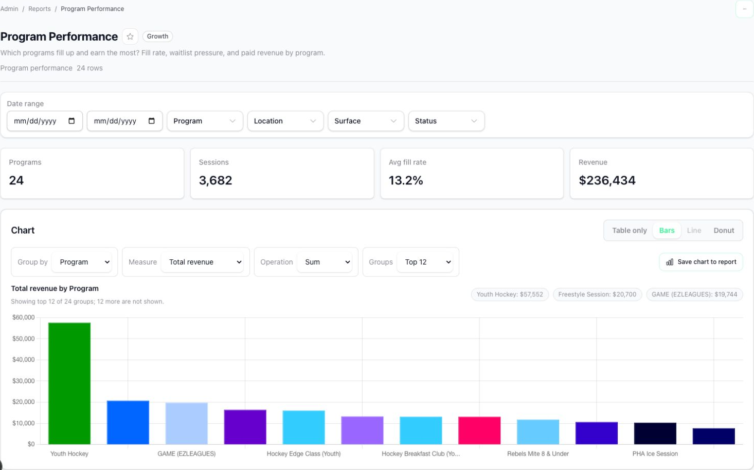
Start with a stock report or build one from scratch. Choose the business area, fields, filters, grouping, calculations, table, and chart. Keep it private for your own analysis or share it with your organization so everyone works from the same saved report.

  • Cover the major operational and financial areas of the business
  • Choose fields, filters, groups, calculations, columns, and chart type
  • Keep reports private or share them across your organization
Centraly custom report builder configured for Program Performance, with KPI cards, fields, filters, grouping and calculation controls, and a revenue chart

Find the days and time blocks that need a decision.

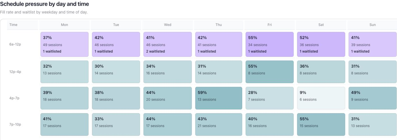
The pressure heatmap reads active registrations against capacity, then adds session volume and waitlists by weekday and time. Compare schedule supply with demand pressure before adding, moving, marketing, or consolidating ice.

  • See sessions by weekday and time of day
  • Read fill rate, session count, and waitlists in one grid
  • Pair pressure with surface workload and progression pacing
Centraly schedule pressure heatmap showing fill rate, session count, and waitlists by weekday and time block

Bring the question your operator or accountant keeps asking. See the answer in one demo.

Tell us what you need.

Give us the basics and we’ll route it to the right team.

We’ll route it to the right person.